Providence Healthcare
My Account Dashboard
The Providence My Account dashboard provides a platform for patients to access their accounts, offering a streamlined booking process compared to MyChart. I developed multiple booking flows and features below.
I can't display all the detailed work on my website, but let's schedule a call to walk you through the process.***
Programs Used:
Figma and Photoshop

The Process
The Problem: The My Account team was tasked with implementing new features into the existing dashboard to ensure users could easily and efficiently book appointments with their healthcare providers through an expedited booking flow. That current journey took multiple clicks and wasn’t user friendly.
My Role: I acted as the Senior UX Designer on this team. I worked closely with the Stakeholders, Project Manager, and UX Manager.
Process: I dedicated time to researching and comparing various booking flows, exploring multiple options for this particular use case. I examined competitors like Zocdoc, MyChart, Curology, and other online medical platforms. Afterward, I created mockups of potential solutions, which I then discussed with our stakeholders, taking into consideration the level of effort (LOE) and our developers' bandwidth. Once we agreed on a solution, I prepared documentation for the developers and conducted User Acceptance Testing (UAT).
The Solution: Assets I produced:
Audits and Benchmarking
User Booking Flows
Wireframes, Information Architecture, and Hifi Prototypes
What I learned: Sometimes, features and use cases are much simpler than anticipated. It's easy to overthink or offer multiple solutions. However, being overly prepared is also valuable, contributing to solutions just in case they are needed.
-
![]()
PLX Dashboard
The dedicated page for the personalized dashboard experience is specifically tailored for pregnant women in their healthcare journey, providing them with content and AI recommendations relevant to their needs. This page served as a user testing platform to gauge whether users would be interested in such a tailored experience.
-
![]()
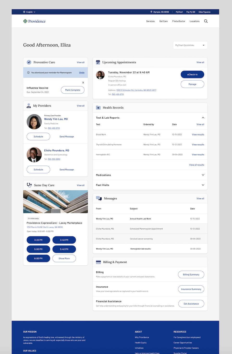
Dismiss Feature
The dismiss functionality is a feature designed to enable users to receive suggested preventative care notifications from Providence, such as reminders for mammograms or flu shots. Users have the option to dismiss these reminders if the content is not relevant to them or if they have already followed the recommended action.
-
![]()
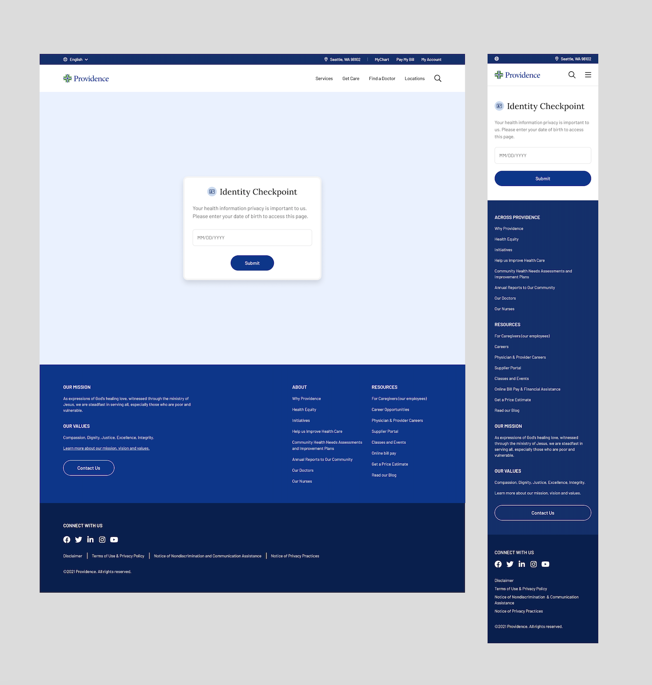
User Authentication
Verifying a user's identity for securing dashboard access involves submitting credentials like date of birth and email verification. The design objective is to establish a secure yet user-friendly authentication experience, balancing accessibility with the protection of sensitive information.
-
![]()
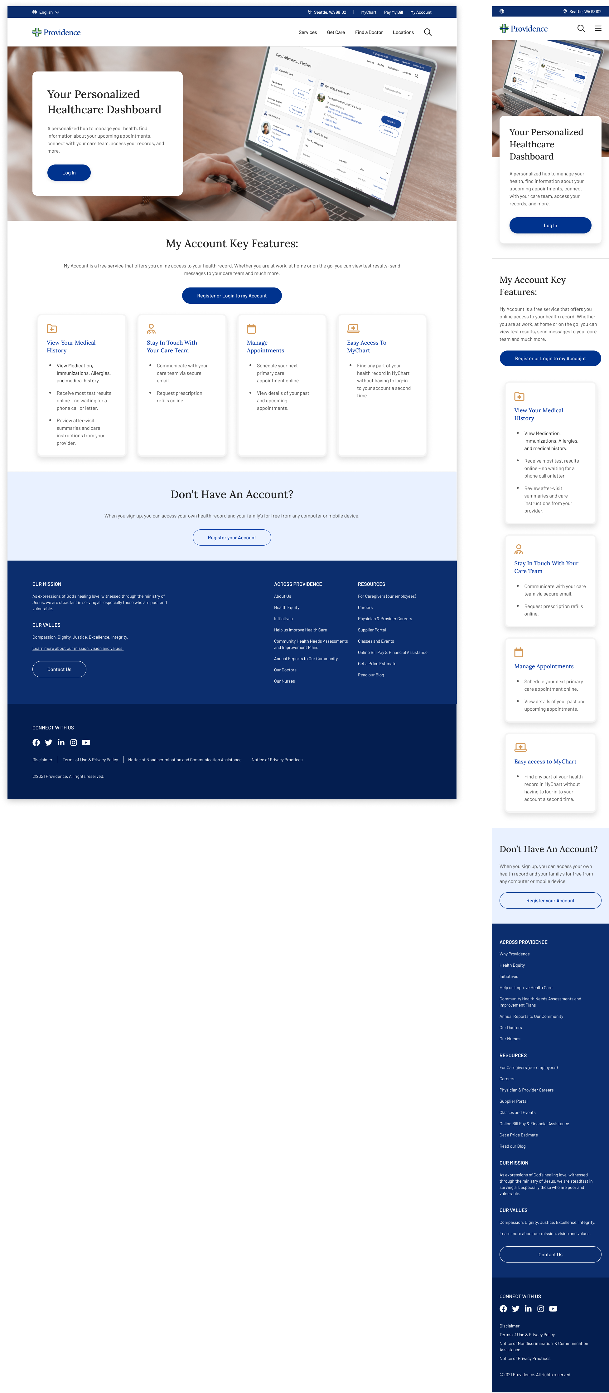
My Account Landing Page
The objective of the My Account landing page is to guide users from a marketing campaign, urging them to sign up and emphasizing the value of doing so. The page actively promotes the importance of signing up and encourages those without an account to register.